Quote:
Originally Posted by sharcnorris

Last night Vax worked with gr8sho92 to bring better contrast to the lettering on a cell phone screen. With so many new devices hooking up to the I/Net via smaller screens, they are tinkering to make it more visible. you will remember that in the Now playing window it was often orange on Brown as Gr8 pointed out.
The goal makes alot of sense to me.... I like Confederate Blue, but who know, Maybe fluorescent Green or Hot Pink!
|
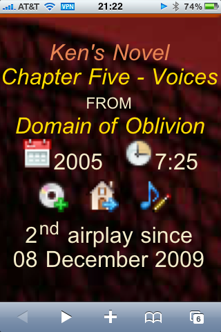
What's being shown is how I setup my iphone when I'm streaming AM in my car using any number of radio apps, at last count 3 that are able to pull the Patron stream. Use Safari browser and zoom in on that part of the web page.
Here's a side by side comparison of old vs new. It's the album artist field that matters. The contrast in previous scheme wasn't enough to be easily visible from a distance.
The iPhone sits in a dock on the center console. The use case is to simply be able to glance at the display and see information about the track being played.